Case study
Wellness and nutrition e-commerce
Wellversed
Redesigning a wellness commerce experience around trust, discovery and confidence.
I worked directly with the CEO and an outsourced development team to rethink Wellversed's e-commerce experience, from information architecture and product discovery through to responsive UI, product pages, SEO-aware structure and a design system.
Three ways to read this. Pick the one that fits the time you have.
- Role
- UI Designer
- Duration
- About 8 months
- Team
- CEO and outsourced development team
- Scope
- HomepageProduct listingProduct detailResponsive UIInventory system researchDesign systemSEO-aware design
In four lines
Business goal
Increase sales by making the experience easier to understand, navigate and trust.
User goal
Find the right wellness product with less confusion and more confidence.
My role
UI Designer, working directly with the CEO and the outsourced development team.
Core challenge
Modernise an ageing e-commerce experience while balancing UX, business requirements, SEO and what could actually be built.
01 / 11Overview
01 · Overview
The problem was not that the website looked old.
It looked dated, certainly. But that was the symptom, not the illness.
The deeper problem was that users had to work too hard to understand what to buy.
Wellversed already had a working e-commerce platform. The interface leaned on older layouts, interaction was limited, and the information hierarchy was weak. Product discovery was less clear than it needed to be, search needed work, and categories needed stronger organisation. Important product information was not surfaced where a decision was actually being made.
Trust mattered more here than it would in most retail categories. People buying supplements want to know what is in the product, who made it, and whether anyone independent has verified any of it. Certificates, trust badges and reviews existed, but they were not visible at the moment they would have changed someone's mind.
So the redesign stopped being a visual modernisation exercise fairly quickly. The goal became making the experience easier to understand, easier to navigate, and easier to trust.
~8 months On the project
Start to handover, working with the CEO and an outsourced team.
~25 people Survey participants
Exploratory Google Forms survey across several communities. Not a representative sample.
4 inputs Research methods
Stakeholder, benchmark review, behavioural data, interviews and survey.
6 groups Participant types
Athletes, gym users, health-conscious buyers, family buyers, weight management, general wellness.
11 questions Asked across two interviews
Eight with Mohit, three with Shrishti.
17 pages In scope
Counted from the page prioritisation in the architecture chapter.
Business context
Two shoppers, one storefront
Wellversed sells its own products alongside other brands, across several categories, serving quite different wellness goals. That creates a specific structural problem.
The site had to serve someone who already knew the exact product they wanted, and someone still working out which product was appropriate for them at all. Those two people want opposite things from a homepage. One wants to get out of it as fast as possible. The other wants it to teach them something.
Intent-driven shoppers
Know the product or the category. Want search, accurate results and a fast route to checkout. Every extra decision is friction.
Discovery-driven shoppers
Know the goal, not the product. Want structure, comparison and enough information to feel they have chosen well rather than guessed.
02 · Challenge
How do you modernise an e-commerce experience without simply making it look modern?
- 01
Discoverability
Users needed to reach relevant products faster, through search, categories and navigation that actually reflected how people were looking.
- 02
Trust
Wellness purchases need credible information. Certification and review content had to become part of the decision, not a footer.
- 03
Cognitive load
Enough information to decide, not so much that deciding becomes work. These pull against each other constantly.
- 04
Mobile
Responsive behaviour was an explicit project goal, not a final pass over the desktop layout.
- 05
SEO
Structure and content hierarchy had to support crawling and indexing, which meant semantic order mattered as much as visual order.
- 06
Development
The design had to survive implementation by an outsourced team working in an existing codebase.
The challenge was not producing a beautiful Figma file. It was producing an experience that survived contact with the real world.
03 · Research
What I actually looked at
Four inputs, each answering something the others could not.
- 01
Stakeholder input
QualitativeAn initial requirements document from the CEO, followed by direct conversations with stakeholders. This set the business context and the priorities I was designing against.
- 02
Benchmark review
ComparativeI reviewed how other wellness commerce experiences handled product presentation, PDP information, trust signals, certifications, reviews, navigation, category organisation and mobile behaviour. Men Matters, Bodywise and Mamaearth were used as reference experiences.
- 03
Behavioural data
QuantitativeGoogle Search Console, Microsoft Clarity, SEMrush and Google Tag Manager observations. These told me how people were searching, where they were landing, what they engaged with, and where search visibility was being lost.
- 04
Interviews and survey
MixedInterviews to understand how people evaluate wellness products, plus a Google Forms survey shared with roughly 25 participants across several communities, including athletes, gym users, health-conscious buyers, family buyers and people focused on weight management.
A note on the survey, because it matters for how much weight the findings should carry. Twenty five self-selected participants across mixed communities is exploratory. It is enough to notice a pattern worth designing against. It is not a representative sample, and I have not treated it as one anywhere in this project.
The behavioural data did the heavier lifting on questions of scale. The interviews did the heavier lifting on questions of why.
| What does the business need? | How are people searching? | What builds trust? | What information is needed to decide? | How do people compare options? | |
|---|---|---|---|---|---|
| Stakeholder input | Stakeholder input informed What does the business need? | Stakeholder input did not inform How are people searching? | Stakeholder input did not inform What builds trust? | Stakeholder input did not inform What information is needed to decide? | Stakeholder input did not inform How do people compare options? |
| Benchmark review | Benchmark review did not inform What does the business need? | Benchmark review did not inform How are people searching? | Benchmark review informed What builds trust? | Benchmark review informed What information is needed to decide? | Benchmark review informed How do people compare options? |
| Behavioural data | Behavioural data did not inform What does the business need? | Behavioural data informed How are people searching? | Behavioural data did not inform What builds trust? | Behavioural data did not inform What information is needed to decide? | Behavioural data did not inform How do people compare options? |
| Interviews | Interviews did not inform What does the business need? | Interviews did not inform How are people searching? | Interviews informed What builds trust? | Interviews informed What information is needed to decide? | Interviews informed How do people compare options? |
| Survey | Survey did not inform What does the business need? | Survey did not inform How are people searching? | Survey informed What builds trust? | Survey informed What information is needed to decide? | Survey did not inform How do people compare options? |
Read the gaps rather than the marks. Only one method spoke to how people were actually searching, so that column rests entirely on the behavioural data. Anywhere a column has a single mark, the finding is thinner than it looks, and I have tried to write about those areas with correspondingly less certainty.
Asset needed
Screenshots of the Search Console, Clarity and SEMrush findings that informed the discovery work
These existed during the project as working analysis rather than presentation artifacts. Reconstructing them now would mean drawing conclusions I can no longer verify against the original data, so they are named rather than recreated.
04 · Interviews
Two conversations that changed the brief
Mohit
Software engineer, regular wellness-product buyer
ObjectiveUnderstand how someone evaluates a wellness product before purchasing.
8 questions explored
- What products do you normally buy?
- What information do you look for?
- What makes a wellness product feel trustworthy?
- What actually helps you decide?
- How do you find the right product?
- How do reviews affect your decision?
- Do you compare products?
- Do you share products with anyone before buying?
Information creates confidence
Relevant, understandable product information is what moves someone from interested to decided. Not more information. The right information.
Trust signals carry weight
Certificates, trust badges and reviews all contribute to whether a product reads as credible, particularly for something you are going to ingest.
Buying is often social
Mohit described sharing products with friends or colleagues and asking their opinion before committing. The decision does not always happen alone, or in one session.
So whatTrust cannot live at the bottom of the product page. It has to be woven into the decision itself.
Shrishti
Content writer
ObjectiveUnderstand what information people expect when evaluating a wellness product.
3 questions explored
- What do you need to know before you buy?
- What is missing from product pages you have used?
- How do you compare one product against another?
The list is longer than most PDPs assume
Quantity, ingredients, benefits, what the product is actually for, who makes it, how to use it, and how it compares to the alternatives.
Description is not the same as decision support
A page can describe a product completely and still leave someone unable to choose it.
So whatThe product page should answer one question above all others: is this the right product for me?
05 · Synthesis
Five themes, one insight
- 01
Product discovery
People need clearer routes to relevant products than the site was offering.
- 02
Trust
People need credible information before they will commit to a wellness purchase.
- 03
Decision support
People need enough to compare and evaluate, not just enough to read.
- 04
Variety
Different users arrive with different goals, preferences and budgets.
- 05
Guidance
The site should help people navigate choices, not simply display inventory.
The strongest pattern in the research was that perceived value was not driven by price alone.
People also weighed trust, choice, product quality, information and their own confidence. Stated as an observed pattern from exploratory research, not a statistically proven finding.
That reframing is the most useful thing the research produced, because it changed which question the team was answering.
The question stopped being how do we sell more, and became how do we help someone feel confident enough to choose. Those lead to genuinely different interfaces. The first one produces urgency and promotion. The second produces clarity and evidence.
What research showed
What the design did about it
People struggle to find the right product
Improve search, categories and navigation
People need trustworthy information
Surface certifications, trust badges and reviews
People compare options before buying
Strengthen product information and comparison cues
People arrive with different goals
Support categories, filters and multiple discovery routes
People get overwhelmed by choice
Reduce cognitive load at every step
People sometimes need a human
Make support reachable, including over WhatsApp
06 · Principles
Five rules I designed against
- 01
Reduce cognitive load
Every interface decision should make the next decision easier than the last one.
- 02
Help people find the right product
The goal is not to show everything. It is to surface what is relevant to this person, now.
- 03
Build confidence before conversion
Trust belongs throughout the journey, not bolted on at checkout when it is already too late.
- 04
Make discovery meaningful
Expose useful products and categories without the experience turning pushy.
- 05
Design for the real product
A design is not finished when it looks right in Figma. It has to work with real content, real code, SEO, responsive behaviour and technical constraints.
Framing
How might we
How might we present essential product information and comparisons so people feel confident enough to buy?
- 01
Narrowing
How might we help people reduce options to what is relevant without it feeling overwhelming?
- 02
Timing
How might we present essential product information at the moment it is needed?
- 03
Comparison
How might we make comparing products easier?
- 04
Trust
How might we build trust before asking someone to purchase?
- 05
Discovery
How might we help people find useful related products without feeling pushed?
07 · Architecture
Structure before surface
The bridge between research and interface, which is usually the part that gets skipped.
How the work actually ran
Step 7 of 7
Nothing visual happened until the structure held up.
01
Core commerce
- Homepage
- Product listing
- Product detail
- Cart
- Checkout
Directly on the primary shopping journey. Everything else is secondary to these five working.
02
Discovery
- Category pages
The main route for someone who knows the goal but not the product.
03
Brand discovery
- Brand pages
Matters because the platform carries other brands alongside its own.
04
Account and support
- Login
- Account
- Support
- Pre-sale
- Post-sale
05
Supporting information
- FAQs
- Privacy
- Shipping
- Returns
- Other information pages
Pages in scope, by priority tier
- 01 Core commerce5
- 02 Discovery1
- 03 Brand discovery1
- 04 Account and support5
- 05 Supporting information5
A count of pages, not a performance measure. It is here because the shape is the argument: core commerce and the two lowest tiers carry the same number of pages, which is exactly why prioritising by journey impact rather than by page count mattered. Five checkout-critical pages and five policy pages are not the same five pages.
A. Homepage discovery
Step 6 of 6
B. Search
Step 6 of 6
C. Educational discovery
Step 5 of 5
D. Assisted purchase
Step 5 of 5
The flow that assumes the person cannot decide alone. Most commerce design pretends this one does not exist.
Asset needed
The IA map and wireframe sequence
These were produced in Figma during the project. They are not exported here yet.
08 · Design
The decisions, and why
- Problem
- The homepage did not make it clear where to begin. It behaved like a billboard when it needed to behave like a starting point.
- Evidence
- Behavioural data showed people were not finding their way to relevant products efficiently. The interviews confirmed that people arrive with a goal rather than a product name.
- Hypothesis
- If the homepage leads with search and category structure rather than promotion, both shopper types get a route in on their first screen.
- Exploration
- I looked at promotion-led, category-led and search-led openings, and at how the benchmark experiences sequenced the same elements.
- Why this one
- It answers the only question the first screen needs to answer: where can I go from here? Promotion still exists, but it stops being the first thing in the way.
- Implementation
- Built with the outsourced team against the Figma design, with the section order treated as semantic order for SEO rather than purely visual order.
- Reflection
- The sequence in the shipped design is the source of truth. Where this write-up and the Figma file disagree, the Figma file is right.
- Problem
- People need variety, but variety is exactly what creates overload. A listing page that shows everything helps nobody.
- Evidence
- The synthesis surfaced both 'variety' and 'people get overwhelmed by choice' as themes. Those are the same finding from two directions.
- Hypothesis
- Structure converts variety from a liability into an asset. If filtering and categorisation are strong enough, more products becomes a feature.
- Exploration
- Category structures, filter models, product tagging, card density and the amount of information a card should carry before it becomes noise.
- Why this one
- The objective is not to show the catalogue. It is to narrow it until the right products become obvious.
- Implementation
- Card and filter components were specified as part of the design system so listing behaviour stayed consistent as the catalogue grew.
- Reflection
- Filtering is where a catalogue this varied either works or falls apart. It deserved more of my attention than the visual design of the card did.
- Problem
- The existing product page was informational. It described the product without helping anyone decide on it.
- Evidence
- Both interviews landed on the same place. Mohit needed trust signals and social validation; Shrishti needed quantity, ingredients, benefits, purpose, brand and comparison.
- Hypothesis
- If the page is ordered by decision importance rather than by what the business wants to say, the same content does considerably more work.
- Exploration
- Several orderings of product information, trust content and variant selection, checked against what the benchmark experiences surfaced and where.
- Why this one
- A wellness product raises more questions than a typical retail product. What is in it, how much do I need, what does it do, can I trust it, how does it compare, is it right for me. The page has to answer those in roughly that order.
- Implementation
- Variant selection and trust modules were specified as reusable components. Only the options present in the source design were built.
- Reflection
- Adding WhatsApp support was the decision I would defend hardest. It admits the interface will not be enough for everyone, which is uncomfortable to design for and true.
- Problem
- Some people simply cannot tell which product is right for them, no matter how well the page is organised.
- Decision
- Put a direct route to a human on the product page, on the channel the audience already uses daily.
- Reasoning
- A chatbot answers the questions you anticipated. The people who are stuck are stuck precisely because their question was not anticipated. WhatsApp also keeps the conversation somewhere the customer already lives rather than trapping it in a session that dies when the tab closes.
- Impact
- Qualitative. It gave the assisted-purchase flow somewhere real to go instead of ending at a dead end.
A design framework derived from the interviews, used to decide what appears where on the product page. It is a way of ordering decisions, not a measured model.
Before
Asset needed
A capture of the original Wellversed product page
No archived screenshot of the previous site was kept. Rather than mock up a 'before' from memory and present it as evidence, the comparison is left open.
After
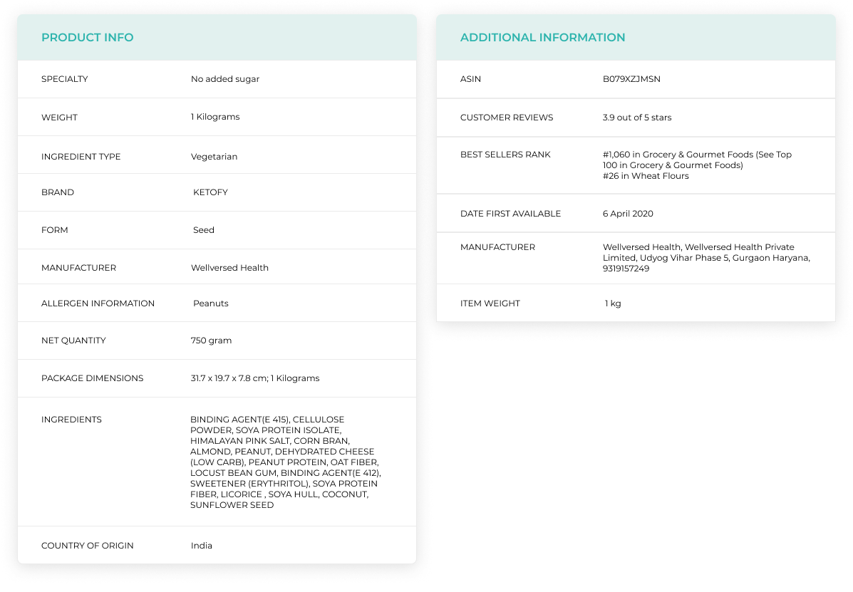
Before and after, product detail
- Information ordered by decision importance rather than by business priority
- Trust content raised into the decision rather than left in the footer
- Variant selection made explicit
- A route to a human where the interface runs out
09 · Craft
Responsive, semantic, systematic
Responsive behaviour was an explicit goal rather than a final pass. Navigation, product cards, filters, typography scale, content hierarchy, touch targets and CTA placement each needed a decision at every breakpoint, and mobile got recomposed rather than shrunk.
Constraint
SEO shaped the structure, not the other way round
SEO was not something applied after the design was finished. Heading hierarchy, semantic sections, content order, category structure and crawlability all influenced how pages were built, because visual hierarchy and semantic hierarchy have to agree. When they disagree, you get a page that looks organised and reads as noise to a crawler.
I am not claiming ranking improvements. I did not run the analysis that would let me claim them, and the structural work and any traffic change would be difficult to separate cleanly.
Typography
A heading scale that carries both visual and semantic weight, so an H2 looks like an H2 and is one.
Components
Buttons, cards, tags, badges, form controls and product components, specified once and reused.
Foundations
Spacing, grid, colour and responsive behaviour, defined so the same decision did not get remade per screen.
The design system was the shift from one-off screens to a reusable language.
Which mattered more than usual here, because the people building it were not in the room.
Asset needed
Design system sheets and the responsive breakpoint comparisons
Built in Figma during the project, not yet exported for the portfolio.
10 · Development
Designing was half the job
Figma is not the product.
The hardest part of this project was not deciding what the interface should be. It was getting those decisions to survive being built by an outsourced team, in an existing codebase, with real content of unpredictable length.
A design can be right in Figma and wrong in the browser. Responsive behaviour, content variation, component states, performance, spacing and browser differences all sit between the file and the product. So collaboration became part of designing rather than something that happened afterwards.
The loop
Step 6 of 6
The arrow back from QA is the part that actually determined quality.
- Problem
- An outsourced team cannot ask a quick question across a desk. Ambiguity in a file becomes a guess in the product.
- Decision
- Specify component states, responsive behaviour and content edge cases explicitly rather than relying on the visual file to imply them.
- Reasoning
- Every unspecified state is a decision someone else makes on your behalf, usually under time pressure and without the research context. Writing them down is cheaper than reviewing them later.
- Impact
- Qualitative. Fewer round trips, and design intent that held up in the browser more often.
Adjacent work
Inventory system research
Alongside the storefront, I researched an internal inventory-management experience: how SKU information, inventory visibility and internal workflows might be brought into one place.
This stayed research and design exploration. I am not presenting it as a shipped system, because it was not one.
Asset needed
Inventory system exploration screens
11 · Reflection
What the project changed about how I work
Before Wellversed I thought of the interface as the final layer of a product, the part you apply once the thinking is done. Eight months on a live commerce environment took that apart.
The interface is connected to everything behind it. Business goals, content, users, development capacity, SEO, performance, technical constraints. A beautiful interface that ignores any of those is not finished, it is just attractive. The real work was creating clarity inside a complex system.
- 01
UI is not the whole product
It is the visible end of a system, and it inherits every problem in that system.
- 02
Trust is a UX problem
Not a marketing one. Where credibility appears changes whether people believe it.
- 03
Information architecture affects the business
How a catalogue is structured determines what people can find, and what they cannot find they cannot buy.
- 04
SEO and UX can support each other
Semantic structure and clear hierarchy are the same work, described by two disciplines.
- 05
Developer collaboration improves design
Constraints surfaced early make better designs than constraints discovered late.
- 06
Research should reach the interface
If a finding does not change a screen, it has not been used.
Outcome
What changed, stated honestly.
- 01
More structured product discovery, with search, categories and filtering treated as the primary route rather than an afterthought
- 02
Trust content moved into the decision, where it can change a mind, rather than the footer
- 03
A product page rebuilt around deciding rather than describing
- 04
Responsive behaviour designed per breakpoint rather than scaled down from desktop
- 05
Stronger alignment between the design file and what actually shipped
- 06
A reusable design system in place of one-off screens
- 07
SEO treated as a structural constraint during design rather than a later fix
On metrics
These are qualitative on purpose. I do not have verified figures for conversion, add-to-cart rate, organic traffic or revenue attributable to this work, and quoting numbers I cannot defend in an interview would undo the point of the whole case study. If verified metrics become available, they belong here.
Good design is not about giving people more choices. It is about helping them make the right choice with confidence.